Accordion
Accordions are useful when you want to toggle between hiding and showing a large amount of content, empowering user control and decision making.Basic Accordion
The accordion component can be created by calling the UI::accordion() method.
The accordion is made of items, each item is a collapsable block and they can be added using the addItem() method, this method accepts the following arguments:
id: The item id, this id should be unique between accordion items.heading: The item heading.content: The item content.expanded: Sets if an item should be expanded or collapsed by default.
Options
The accordion component can be customizable using theaccordionOptions() method, this method accepts the constant values the accordion component has, and it can receive multiple values at the same time.Accordion::FLUSH: Removes borders from items.Accordion::WITHOUT_ICONS: Hides items chevron icons.Accordion::WITH_PLUS_ICON: Changes chevron icons for plus and minus icons.Accordion::ICON_ON_LEFT: Places the chevron icons to the left of the item.Accordion::WITH_BORDER: Adds a thicker left border.Accordion::FILL_BACKGROUND: Keeps the head background colored when the item is opened.Accordion::KEEP_OPEN: Keeps the items opened when another item opens, by default the opened items are closed when another opens.
Accordion Options Examples
Here are examples of each accordion option to showcase their visual effect.Flush Accordion
The Accordion::FLUSH option removes borders from accordion items, creating a cleaner appearance.
Accordion Without Icons
The Accordion::WITHOUT_ICONS option hides the chevron icons in accordion items.
Accordion With Plus Icons
The Accordion::WITH_PLUS_ICON option changes the standard chevron icons to plus/minus icons.
Accordion With Icon on Left
The Accordion::ICON_ON_LEFT option places the chevron icons to the left side of the accordion headings.
Accordion With Border
The Accordion::WITH_BORDER option adds a thicker left border to the accordion items.
Accordion With Fill Background
The Accordion::FILL_BACKGROUND option keeps the header background colored when the item is opened.
Accordion With Keep Open Option
The Accordion::KEEP_OPEN option allows multiple accordion items to remain open simultaneously.
Accordion With Combined Options
Multiple accordion options can be combined using the bitwise OR operator (|).
API
The accordion component extends fromHtmlElement so it has all its methods available.API PHP
Common alternative names: NA
Types: Default Accordions, Flush Accordions, Without Icons Accordions, Plus Icon Accordions, Icons on Left Accordions, Border Accordions, Fill Color Accordions, Always Open Accordions
Principles
Intuitive
Ensure that the interaction is clear, easy to understand, and natural for users.
Optimizable
Reduce content presented to users by shortening pages, and offering most important information.
Clear
Provide visually distinct characteristics that indicate that the accordion is interactive.
Anatomy
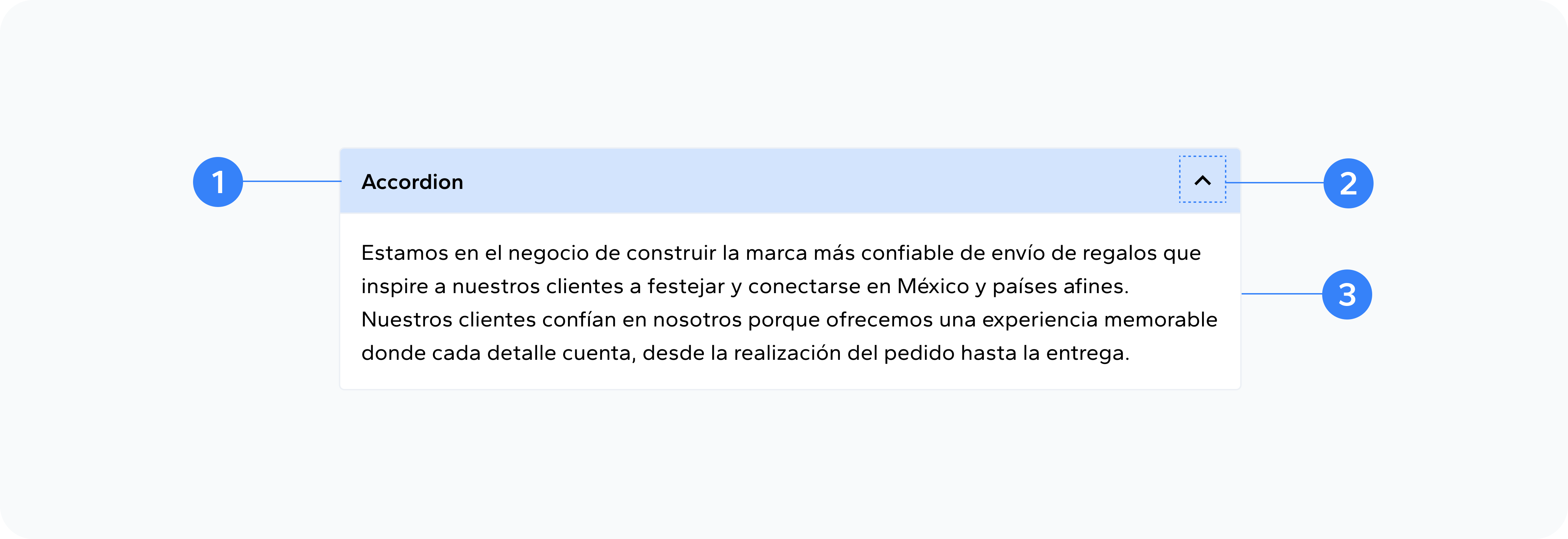
- Heading
- Icon
- Panel
A descriptive title that conveys the gist of the information contained within the accordion
A graphic symbol that signifies the state of the accordion and whether it will expand or collapse
The secondary content that is hidden when the accordion is closed
Usage
An accordion is commonly used to display and manage large amounts of content in a compact, organized manner, especially when space is limited. It allows users to expand and collapse sections of content, ensuring that only the most relevant information is visible at a time, reducing clutter and improving usability.