Modal
A dialog box or popup window component that displays content in an overlay, focusing user attention on specific information or actions while maintaining context with the main interface.Basic Modal
Create a standard modal with title, body, and footer using the UI::modal() method.
Modal Options
The Modal component supports various configuration options.Modal::CENTERED- Centers the modal verticallyModal::STATIC- Prevents modal from closing when clicking outsideModal::SIZE_SM- Sets modal size to smallModal::SIZE_LG- Sets modal size to largeModal::SIZE_XL- Sets modal size to extra large
Modal Examples
Here are examples of different modal options and styles.Static Modal
Create a modal that does not close when clicking outside by using the Modal::STATIC option.
Centered Modal
Create a vertically centered modal by using the Modal::CENTERED option.
Custom Size Modal
Create a modal with a specific size by using options like Modal::SIZE_LG.
Modal with HTML Content
Create a modal with rich HTML content in the body and footer.
Combined Options Modal
Combine multiple options to create a highly customized modal using bitwise operators with the modal options.
API
The Modal component provides methods for creating and configuring modals.API PHP
API JS
Events
You can listen to events on the GridJS component using the bouion() method.Common alternative names: Dialog, Popup, Overlay, Lightbox, Modal Window, Modal Dialog, Popup Window
Types: Default Modals, Static Modals, Centered Modals, Sized Modals, HTML Modals
Principles
Focus Management
Modals manage focus to ensure users can only interact with the modal content while it's open, preventing interaction with the background.
Visual Hierarchy
Through backdrop and positioning, modals establish clear visual hierarchy, making the modal content stand out from the main interface.
Context Preservation
Modals maintain context with the main interface while focusing attention on specific content or actions.
Anatomy
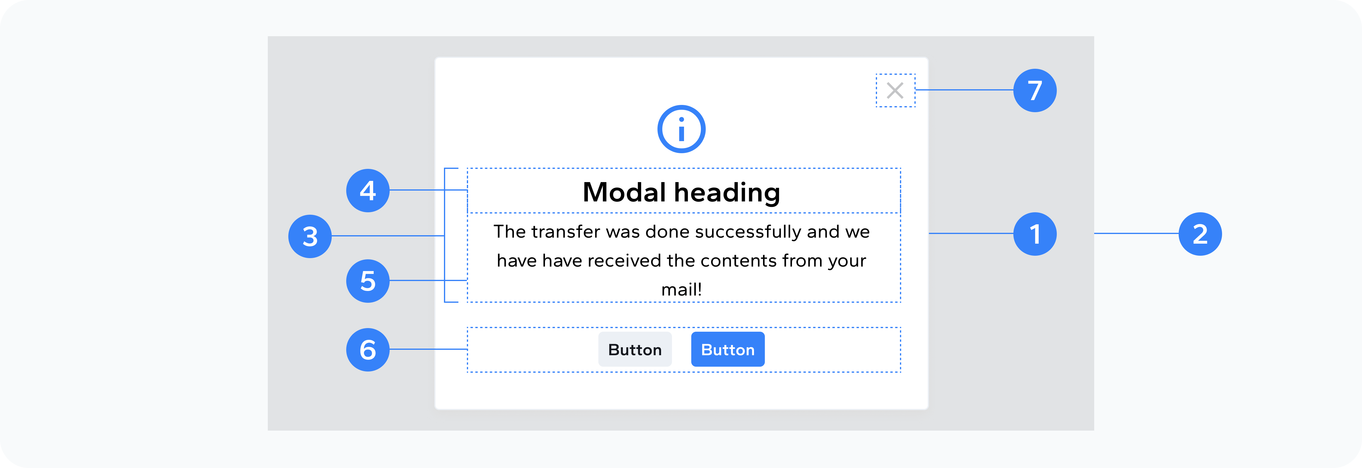
- Modal dialog
- Backdrop
- Content
- Header
- Body
- Action Buttons
- Close Button
The outer wrapper that holds all modal content
The overlay that dims the background
The container within the dialog that holds header, body, and footer
The top section with title and close button
The main content area
The bottom section with action buttons
Button to dismiss the modal
Usage
Use modals to present focused content or actions that require user attention. They're particularly effective for confirmation dialogs, form submissions, content previews, settings panels, error messages, and success notifications.