Popover
A small overlay component that displays additional information or content when triggered, providing contextual help or details without disrupting the main interface.Basic Popover
Create a standard popover with title, content, and a button trigger.
Popover Options
The Popover component supports various configuration options.Popover::TOP- Positions the popover above the trigger elementPopover::BOTTOM- Positions the popover below the trigger elementPopover::LEFT- Positions the popover to the left of the trigger elementPopover::RIGHT- Positions the popover to the right of the trigger elementPopover::AUTO- Automatically positions the popover based on available space (default)
Popover Examples
Here are examples of different popover options and styles.Top Placement Popover
Create a popover that appears above the trigger element by using the TOP placement option.
Bottom Placement Popover
Create a popover that appears below the trigger element by using the BOTTOM placement option.
Left Placement Popover
Create a popover that appears to the left of the trigger element by using the LEFT placement option.
Right Placement Popover
Create a popover that appears to the right of the trigger element by using the RIGHT placement option.
Hover-Triggered Popover
Create a popover that appears when hovering over the trigger element by using the hoverable() method.
Dismissable Popover
Create a popover that can be dismissed by clicking outside or losing focus by using the dismissable() method.
Icon Trigger Popover
Create a popover triggered by an icon element, useful for help and information tooltips.
API
The Popover component provides methods for creating and configuring popovers.API PHP
Common alternative names: Tooltip, Info Box, Info Bubble, Hint, Info Popup, Help Tip, Contextual Help
Types: Click Popovers, Hover Popovers, Focus Popovers, Positioned Popovers, Info Popovers, Help Popovers
Principles
Contextual Information
Popovers provide additional information exactly where it's needed, contextually relevant to the user's current focus.
Progressive Disclosure
By hiding detailed information until requested, popovers help reduce interface clutter while keeping helpful content accessible.
Non-Disruptive Interaction
Popovers appear without interrupting the user's workflow or requiring navigation away from the current context.
Anatomy
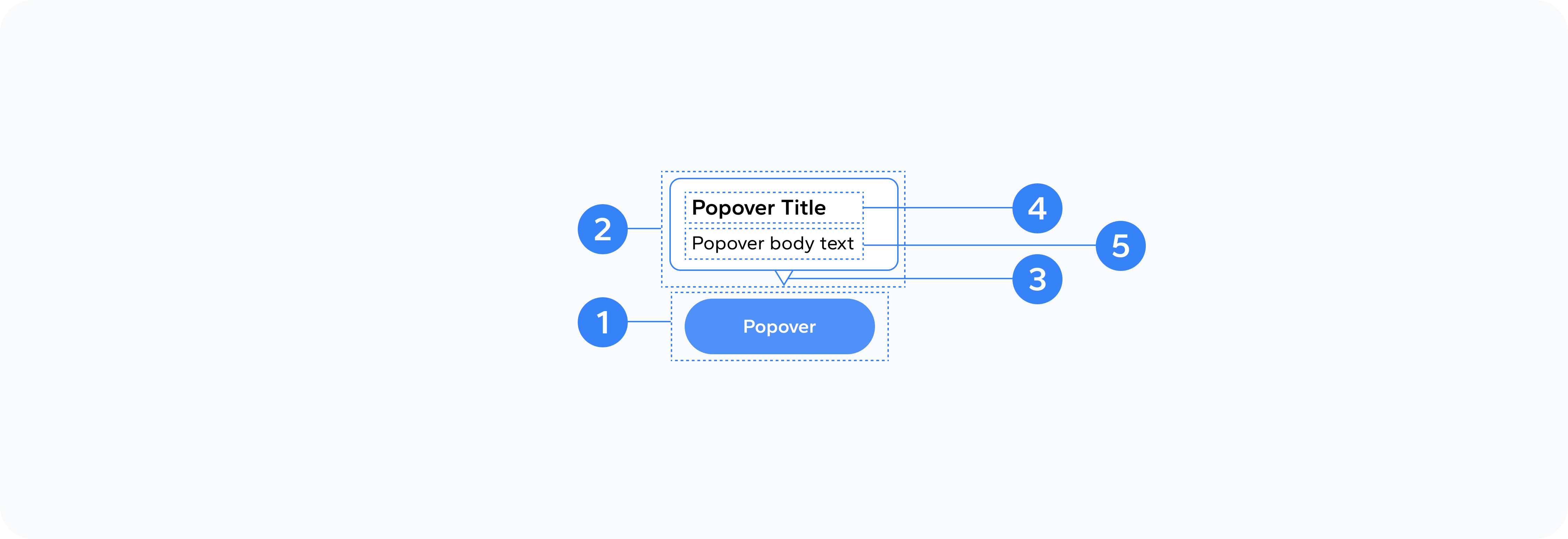
- Trigger Element
- Container
- Arrow
- Title
- Content
The element that activates the popover (button, icon, text, etc.)
The wrapper that holds the popover content
Points to the trigger element, indicating the connection
Optional header text for the popover
The main information displayed in the popover
Usage
Use popovers to provide additional information or context without disrupting the main interface. They're particularly effective for form field explanations, feature descriptions, glossary terms, and contextual help.