TextArea Input
A multi-line text input component that provides resizable text entry areas for longer content such as comments, descriptions, and messages.Basic TextArea Input
Creates a standard textarea field with a name and placeholder.
Options
The TextArea component supports various configuration options.rows: Number of visible text rows (inherited from HTML textarea)cols: Number of visible text columns (inherited from HTML textarea)value: Initial textarea contentplaceholder: Placeholder text displayed when the textarea is emptyreadonly: Sets the textarea to read-only state (inherited from Input)disabled: Sets the textarea to disabled state (inherited from Input)required: Sets the textarea as required (inherited from Input)maxlength: Maximum character limit (inherited from HTML textarea)minlength: Minimum required character count (inherited from HTML textarea)
TextArea Examples
Here are examples of different ways to use the textarea component.TextArea with Row Count
Creates a textarea with a specific number of visible rows.
TextArea with Character Limit
Creates a textarea with a maximum character count.
TextArea with Label and Hint
Creates a textarea with a label and hint text.
TextArea with Custom Styling
Creates a textarea with custom Bootstrap styling and classes.
API
The textarea component extends from theInput class so it has all its methods available.Common alternative names: Multi-line Input, Text Box, Comment Box, Message Box, Text Field (multi-line), Text Editor (basic), Input Area
Types: Basic TextArea, Fixed-size TextArea, Auto-expanding TextArea, Character-limited TextArea, Rich TextArea, Monospace TextArea
Principles
Flexibility
TextArea components accommodate variable-length content, allowing users to express themselves fully without arbitrary constraints. They're spacious enough for complex thoughts while maintaining a compact default footprint.
Usability
TextAreas provide clear visual affordances for multi-line entry, with built-in resizing capabilities that let users adjust the input space to their needs. This enhances the user experience for longer content entry.
Content Focus
By providing a dedicated space for longer text input, TextAreas emphasize the importance of detailed information in the form. They visually distinguish longer-form content from simple single-line inputs.
Anatomy
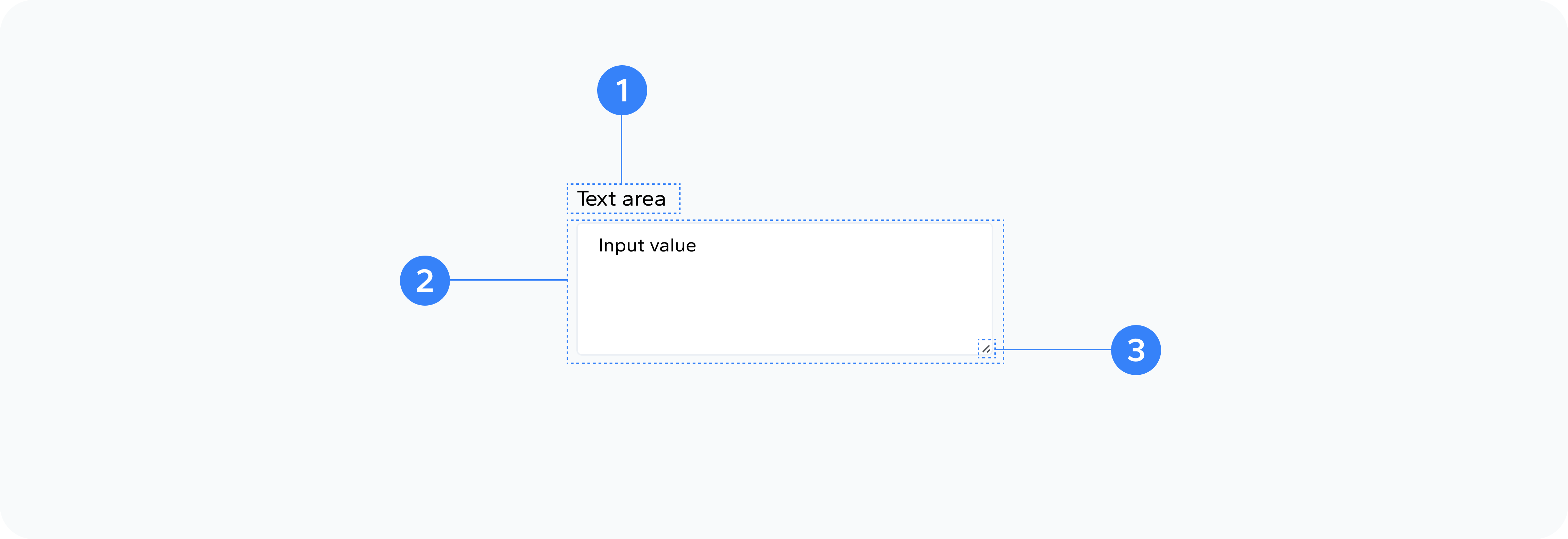
- Container
- Label
- TextArea Element
- Resize Handle
- Scrollbars
- Hint
- Character Counter
Outer wrapper div that holds all elements
Optional text label describing the textarea's purpose
The actual multi-line input field
Browser-provided corner handle for resizing
Appear when content exceeds visible area
Optional helper text providing guidance
Optional display of remaining characters (when implemented)
Usage
Use TextArea inputs for:
- Comments and feedback
- Product descriptions
- Personal bios and profiles
- Messages and communications
- Notes and observations
- Address details
- Any content that might span multiple lines or paragraphs
Best Practices
- Set appropriate default dimensions based on expected content length
- Provide clear placeholders or examples of expected input
- Consider implementing auto-resize functionality for better user experience
- Use character counters for TextAreas with length restrictions
- Ensure the TextArea is large enough to show multiple lines by default
- Consider line wrapping behavior and how it affects the user's writing experience
- Maintain consistent styling with other form elements
Common Patterns
Form Integration
- Contact forms
- Feedback mechanisms
- Comment systems
- Profile editors
- Content management systems
- Survey free-text responses
Content Entry
- Long-form text
- Structured information
- Multi-paragraph content
- Preformatted text
- Code snippets
- Lists and outlines
User Interface
- Expandable input areas
- Fixed-position textareas
- Inline editing areas
- Modal dialog text entry
- Annotation systems
- Commenting interfaces
Accessibility
- Use proper ARIA attributes (aria-label, aria-required, aria-invalid)
- Ensure keyboard navigation functions properly
- Provide clear labels that describe the textarea's purpose
- Ensure error messages are programmatically associated with the textarea
- Maintain focus management for screen readers
- Consider how the resize handle interacts with assistive technologies
- Provide visible focus states for keyboard navigation