List
A versatile list group component that displays items in an organized format, supporting various styling options like active states, disabled items, color variations, horizontal alignment, and badge integration.Basic List
Create a standard list group using the UI::list() method.
- First Item
- Second Item
- Third Item
List Options
The List component supports various styling options and configurations.- Ordered/Numbered Lists: Create sequential numbered lists
- Active State: Highlight active items
- Disabled State: Visually mute and disable items
- Custom Colors: Apply contextual colors to items
- Badge Integration: Add badge indicators to items
- Flush Style: Remove borders and rounded corners
- Horizontal Layout: Align items horizontally
List Examples
Here are examples of different list options and styles.Ordered List
Create a numbered list by setting the second parameter to true.
- First Item
- Second Item
Active Item
Set an item as active by passing true as the second parameter to the item() method.
- First Item
- Second Item
Disabled Item
Set an item as disabled by passing true as the third parameter to the item() method.
- First Item
- Second Item
Colored Items
Apply contextual colors to items by passing the color name as the fourth parameter to the item() method.
- Primary Item
- Success Item
- Danger Item
List with Badges
Add badges to list items by passing a Badge component as the fifth parameter to the item() method.
- Item with BadgeNew
- Regular Item
Flush Style
Remove borders and rounded corners by calling the setFlush() method.
- First Item
- Second Item
Horizontal List
Align list items horizontally by calling the alignHorizontal() method.
- First Item
- Second Item
Horizontal List with Breakpoint
Create a responsive horizontal list by specifying a breakpoint in the alignHorizontal() method.
- First Item
- Second Item
Combined Options
Combine multiple options to create highly customized lists.
- Active ItemNew
- Disabled Item
- Regular Item
API
The List component provides methods for creating and configuring list groups.API PHP
Common alternative names: List Group, Item List, Item Group, Menu List, Selection List, Bootstrap List Group, UI List
Types: Default List Groups, Ordered List Groups, Flush List Groups, Horizontal List Groups, Contextual Color List Groups, Active/Disabled List Groups, List Groups with Badges
Principles
Visual Organization
List groups organize items in a clean, structured format for easy scanning and navigation.
Interactive States
Through active and disabled states, list groups provide visual feedback on user interactions.
Flexibility
List groups can be customized with various styling options and layouts to suit different UI needs.
Anatomy
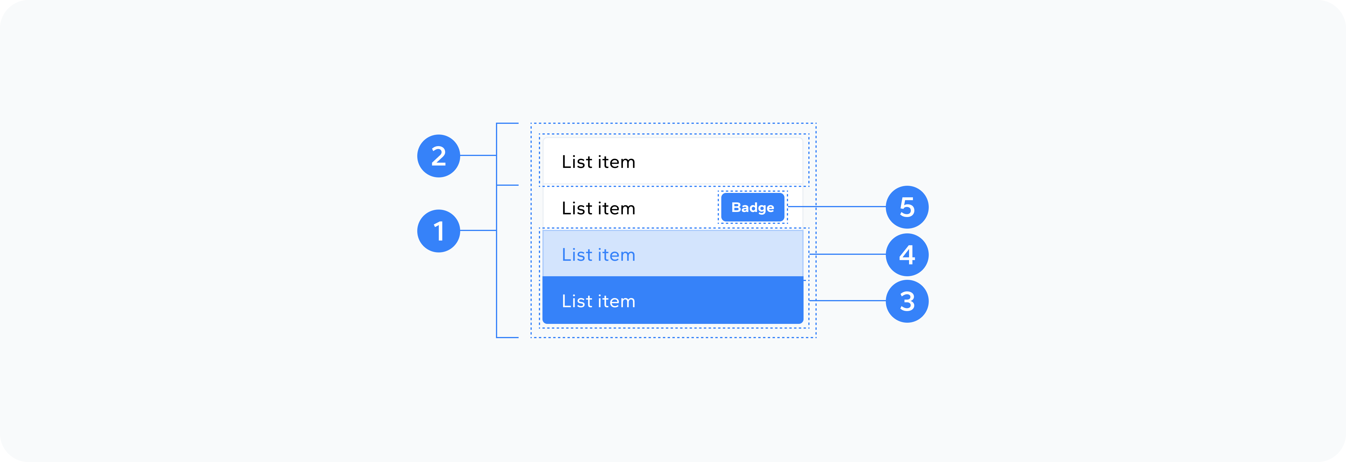
- Container
- List Items
- Selected Item
- Hover Item
- Item Badge
The outer wrapper that holds the entire list component
Individual elements
The selected item in the list
The item that is currently hovered over
A badge component that can be added to an item
Usage
Use list groups to organize and present related content such as navigation menus, simple data lists, selection interfaces, option groups, status lists, and settings panels.