Input
Base form input component used to render all input types with a consistent structure and behavior.Basic Input
Creates a standard input field with a name and placeholder.
Options
The Input component supports various configuration options that can be passed to theattribute method (e.g. attribute('placeholder', 'Enter your username')).autocomplete: HTML5 autocomplete attribute for form auto-fillingmaxlength: Maximum allowed character length for the inputminlength: Minimum required character length for the inputpattern: Regular expression pattern for input validationplaceholder: Placeholder text displayed when the input is emptyvalue: Initial value of the inputicon: Optional icon element to be displayed with the inputiconPosition: Position of the icon ('left' or 'right')
Input Examples
Here are examples of different ways to use the text input component.Input with Validation
Creates a an input with HTML5 validation attributes for email format.
Input with Icon
Creates an input with an icon positioned to the right.
Input with Label and Hint
Creates an input with a label and hint text for additional guidance.
Input with Required
Creates an input that is required for form submission.
Input with Disabled
Creates an input that is disabled and cannot be interacted with.
Input with Readonly
Creates an input that is readonly and cannot be edited.
Input with Custom Styling
Creates an input with custom CSS classes and styles.
Flatpickr Date Input
Creates a date picker input with custom date format and range constraints.
Flatpickr Multiple Dates
Creates a date picker that allows selecting multiple individual dates with a maximum selection limit.
Flatpickr Date Range
Creates a date picker for selecting a date range with start and end dates.
API
The alert component extends fromHtmlElement so it has all its methods available. Using the methods from HtmlElement class you can add html attributes to the input, e.g. attribute('placeholder', 'Enter your username').API PHP
API JS
Common alternative names: Text Field, Input Field, Text Box, Form Field, Input Box, Text Control
Types: Basic Text, Search Text, Password Text, Email Text, URL Text, Tel Text, Autocomplete Text, Rich Text
Principles
User Experience
Text inputs provide a simple and intuitive way for users to enter text data. They should be clearly labeled and appropriately sized for their expected content, with visual feedback for focus and validation states.
Validation
HTML5 validation attributes help ensure data quality and format conformance while providing immediate feedback to users. This reduces errors and improves data integrity.
Flexibility
Text components can be customized with various attributes, styles, and behaviors to suit different contexts and requirements while maintaining a consistent user experience.
Anatomy
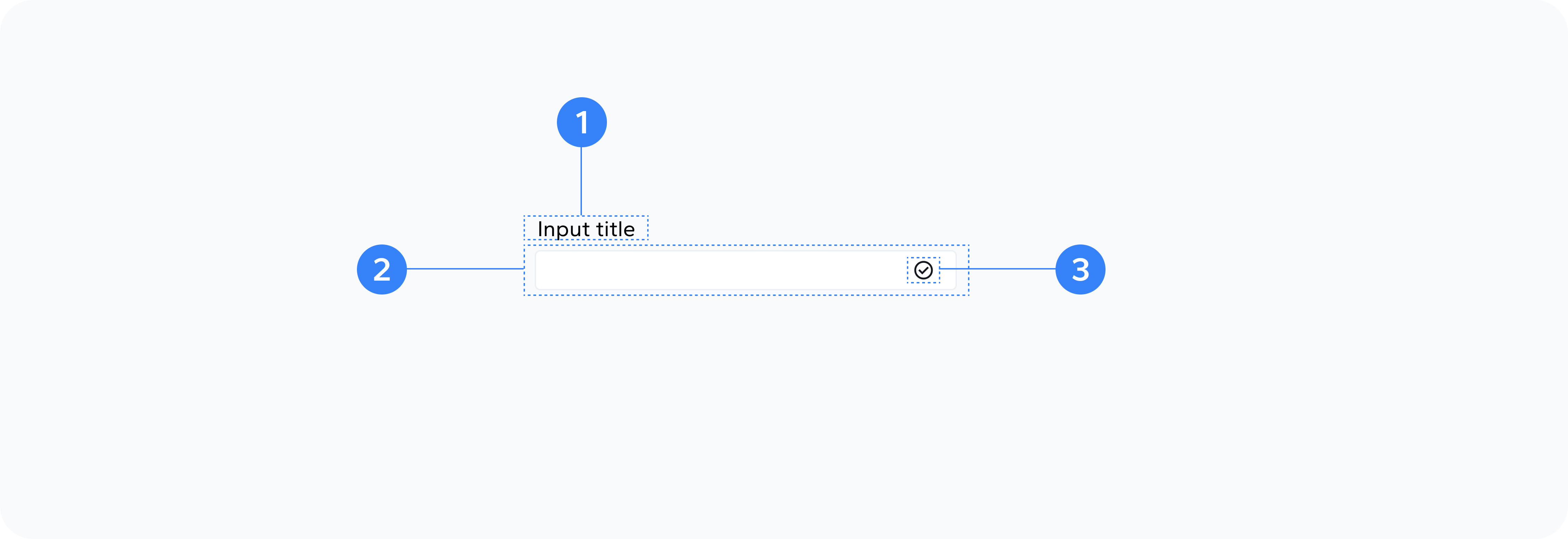
- Container
- Label
- Input Element
- Icon
- Hint
- Validation Feedback
Outer wrapper div that holds all elements
Optional text label describing the input's purpose
The actual text input field
Optional icon element for visual enhancement or action
Optional helper text providing additional guidance
Visual indicators of validation status
Usage
Use text inputs for:
- Single-line text entry
- User information collection (names, emails, etc.)
- Search functionality
- Data filtering
- Configuration settings
- Form submissions
- Command entry