Alert Modal
A specialized modal component designed for displaying alerts, confirmations, and notifications with customizable types, icons, and actions.Basic Alert
Shows a simple alert with a title and confirm button.
Check dev tools console for the alert output
Options
The Alert Modal component supports various configuration options.title: The alert's title text (required)content: The alert's content (optional)type: The alert type ('success', 'warning', 'danger', 'info')confirmButtonText: Text for the confirm button (required)cancelButtonText: Text for the cancel button (optional)static: If true, prevents closing by clicking outside (optional)icon: If true, shows the type-specific icon (optional)
Alert Examples
Here are examples of different ways to use the alert modal component.Confirmation Alert
Shows an alert with both confirm and cancel buttons.
Check dev tools console for the alert output
Static Alert
Shows an alert that cannot be dismissed by clicking outside.
Check dev tools console for the alert output
API
The alert modal component provides a simple interface for displaying alerts and confirmations.Alert Object Properties
The alert object passed to theboui.alert function can have the following properties:Common alternative names: Alert Dialog, Confirmation Modal, Notification Modal, Message Box, Dialog Box
Types: Success Alert, Warning Alert, Danger Alert, Info Alert
Principles
Clarity
Alert modals provide clear, focused messages with appropriate visual cues to indicate their importance and type.
Action-Oriented
Each alert is designed to prompt user action, whether it's acknowledgment or a decision between options.
Consistency
Maintains consistent styling and behavior across different alert types while providing visual distinction between them.
Anatomy
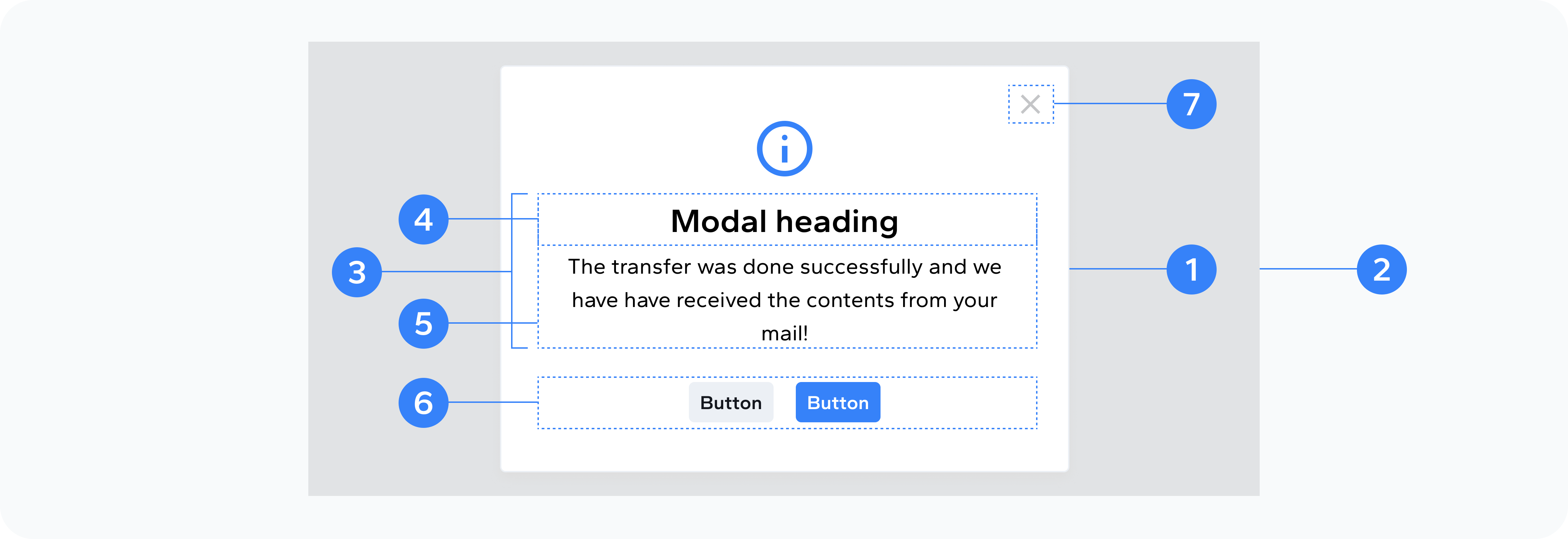
- Modal container
- Backdrop
- Body
- Header
- Content
- Footer buttons
- Close button
Container to display the alert
Background overlay
Contains the alert content
Contains the alert title
Contains the alert message
Contains the alert action buttons
Close the alert
Usage
Use alert modals for:
- Confirming user actions
- Displaying success messages
- Showing warning messages
- Presenting critical errors
- Providing important information
- Requesting user decisions