Alert
Alerts are used to provide feedback to the user about the status of a process or to communicate information.Basic Alert
The alert component can be created by calling the UI::alert() method.
It has three methods to add content:
heading: Sets the alert header.body: Sets the alert body.additionalContent: Adds additional content to the alert, this content is placed below the body.
Options
The Alert component can be customized using thealertOptions() method, it accepts multiple options at the same time.Alert::BORDERLESS: Removes alert borders.Alert::DISMISSABLE: Adds a close button so the alert can be dismissed.Alert::OUTLINE: Changes the alert bootstrap style to be outlined.Alert::BORDER_LEFT: Adds a thicker border to the left.Alert::MODERN: Uses the icon passed as background of the Alert.Alert::BORDER_TOP: Adds a thicker border to the top.Alert::LABEL_ARROW: Uses the icon passed and puts it at the left of the alert within an arrow container.Alert::LABEL_ROUNDED: Uses the icon passed and puts it at the left of the alert within a rounded container.Alert::SOLID: Sets the background of the alert solid.
Alert Options Examples
Here are examples of each alert option to showcase their visual effect.Borderless Alert
The Alert::BORDERLESS option removes alert borders.
Dismissable Alert
The Alert::DISMISSIBLE option adds a close button so the alert can be dismissed.
Outline Alert
The Alert::OUTLINE option changes the alert bootstrap style to be outlined.
Border Left Alert
The Alert::BORDER_LEFT option adds a thicker border to the left.
Modern Alert
The Alert::MODERN option uses the icon passed as background of the Alert.
Border Top Alert
The Alert::BORDER_TOP option adds a thicker border to the top.
Label Arrow Alert
The Alert::LABEL_ARROW option uses the icon passed and puts it at the left of the alert within an arrow container.
Label Rounded Alert
The Alert::LABEL_ROUNDED option uses the icon passed and puts it at the left of the alert within a rounded container.
Solid Alert
The Alert::SOLID option sets the background of the alert solid.
API
The alert component extends fromHtmlElement so it has all its methods available.API PHP
Common alternative names: Notification
Types: Default Alerts, Borderless Alerts, Dismissible Alerts, Outline Alerts, Left Border Alerts, Modern Alerts, Additional Content Alerts, Top Border with Outline Alerts, Label Icon Arrow Alerts, Rounded Label Icon Alerts, Solid Alerts
Principles
Concise
The message should be straightforward, leaving no room for ambiguity about the issue, action, or information being conveyed.
Punctual
Alerts should appear at the right time and in the right context.
Visual
Alerts should stand out visually from the rest of the content. Use different visual styles (color, size, icons) to indicate the importance and type of the message.
Anatomy
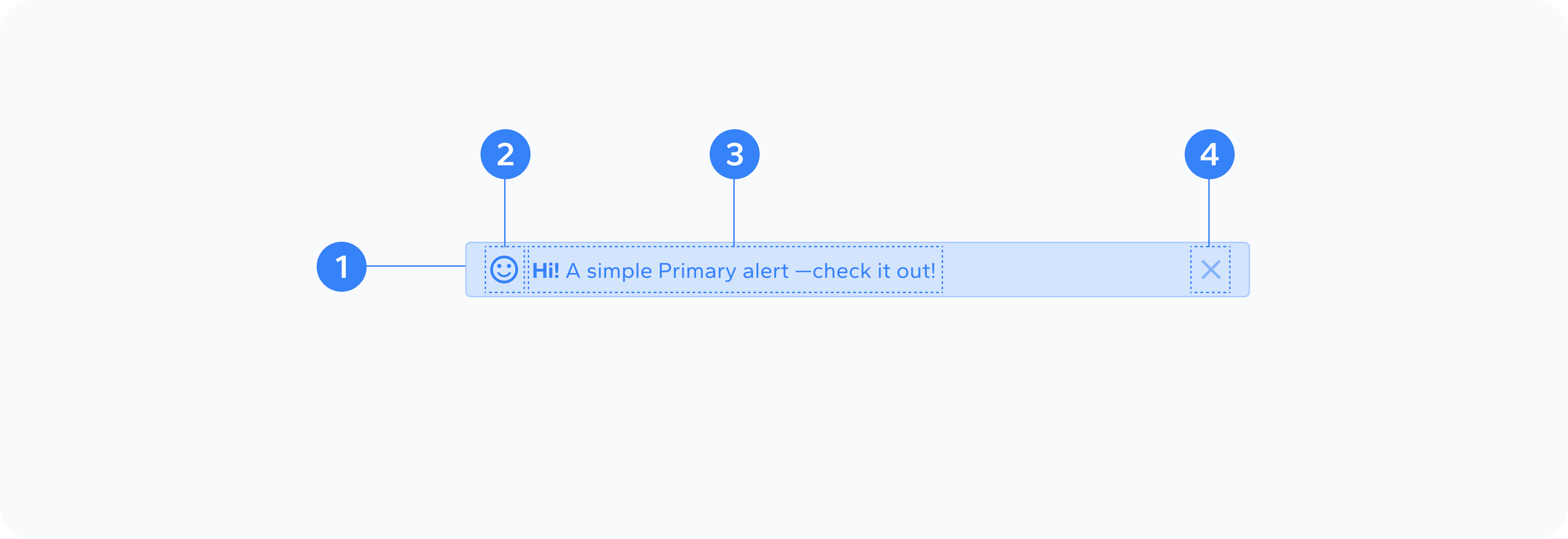
- Container
- Icon
- Content
- Close Button
The outer wrapper that holds the alert content
Optional visual indicator showing the alert type
The main message text of the alert
Optional button to dismiss the alert
Usage
An alert UI component is used to inform users about important messages, warnings, or feedback within an interface. Whether it's a confirmation, an error, or a success message, the alert component plays a key role in communication.
Usage Cases
Not all alerts are of equal importance. Make sure the design reflects the priority of the message: